The Hockey Sweater
Ever wonder why a hockey jersey is often referred to as a "sweater"? The answer is quite simple—back in the early days of hockey, that's precisely what players wore: sweaters, akin to those you might find at your local men's store. Teams would typically purchase several sweaters in the same pattern, add a number on the back, and occasionally a logo on the front, calling it a day. However, times have changed dramatically since then!
Early jerseys often featured unique patterns, like barber-pole stripes or contrasting chest bands, and with television still decades away from being invented, there was little necessity for teams to have more than one jersey. After all, distinguishing between a red jersey and a blue jersey was easy enough for everyone in the arena!
Color Palettes
As the calendar moved into the late 1930s, the landscape of hockey jerseys began to transform, with solid color jerseys starting to take shape. This era marked the emergence of more intricately designed crests, while player pants transitioned from neutral canvas hues to colors that matched the team's palette. Speaking of colors, the Original Six era was characterized by a commitment to traditionalism, as most teams adhered to a classic palette. Between 1942 and 1967, jerseys predominantly featured the colors red, blue, black, gold, or white, solidifying a timeless look that remains iconic in the sport’s history.
The Expansion
With the addition of six new teams, the NHL suddenly became a vibrant tapestry of colors, representing nearly every hue of the rainbow on league jerseys. The Los Angeles Kings made a bold statement by introducing purple—officially known as Forum blue—to the NHL landscape, while the Philadelphia Flyers reintroduced the striking color orange that would soon become synonymous with their identity. Meanwhile, the California Seals (later Oakland Seals) and the Minnesota North Stars made an impact on the ice by donning distinct shades of green.
However, if the NHL believed they had witnessed it all with this colorful expansion, they were sorely mistaken, as the evolution of team identities and jersey designs was just beginning to unfold, paving the way for even more exciting innovations in the years to come!
Design Blunders
The NHL expanded into Washington, DC, in 1975 with the establishment of the Washington Capitals, who made the questionable decision to pair their red jerseys with white pants, leading to widespread ridicule as they limped to a mere eight wins in their inaugural season.
Perhaps the most radical design blunder of the late 1970s came from the Vancouver Canucks, who, for a hefty fee of $100,000, hired a marketing firm to redesign their uniforms. The result was a loud, garish look featuring enormous "V's" intended to symbolize "victory" rather than "Vancouver," which ultimately became one of the most maligned visual identities in North American professional sports. Upon becoming general manager, Pat Quinn quickly recognized the need for a redesign to liberate the team’s image from this unfortunate aesthetic.
What's in a Name?
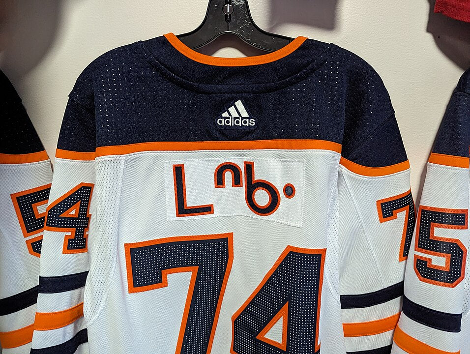
The 1970s marked a pivotal shift in NHL jersey design with the re-introduction of player names on the backs, a concept that had previously flopped when the New York Americans experimented with it in 1926. However, this time around, another New York team, the Rangers, led the way, and names quickly gained acceptance across the league. Up until the 1977 season, home teams had the discretion to display names, while road teams could do so only with permission from the home team. However, with the onset of the 1977-78 season, the NHL mandated that all jerseys would feature names, standardizing this new element of team identity. Initially, names were placed straight across the back, but in 1982, the Detroit Red Wings innovated by becoming the first team to adopt vertically-arched names.
The Introduction of Helmets
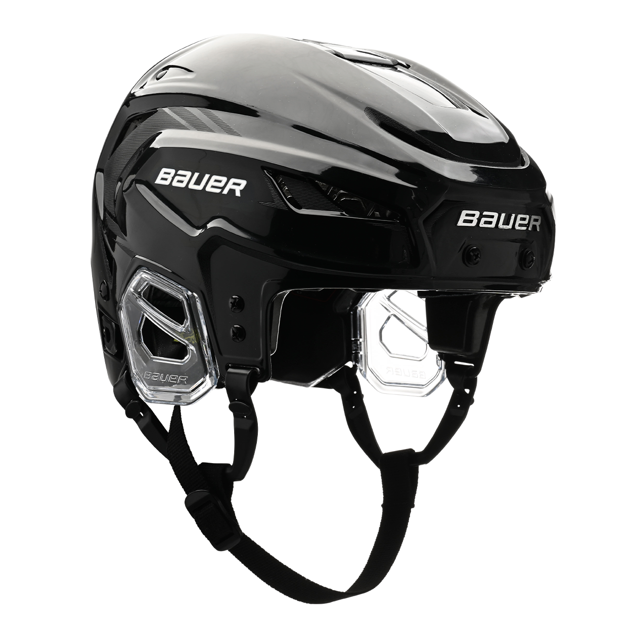
The tragic death of Bill Masterton, a player for the Minnesota North Stars, in January 1968 following injuries sustained during a game became a pivotal moment in NHL history, leading to an increased emphasis on player safety and helmet use. In response to growing concerns, the league implemented a new rule in 1979 requiring all players who signed their NHL contracts after June 1 of that year to wear helmets while on the ice.
Some Big Swings
The mid-1990s saw a surge of unconventional and eye-catching designs in NHL uniforms. This began with the New York Islanders, who donned a wild new jersey featuring a logo of a man resembling the Gorton's fisherman, prompting rival Rangers fans to chant, "We want fishsticks!" However, these outlandish logos were retired after just two seasons.
In early 1996, as the NHL's third jersey program gained momentum, other teams joined the trend with equally eyebrow-raising designs. The Mighty Ducks unveiled a jersey showcasing a massive duck crashing through the ice in goalie gear, while the Kings sported a white jersey that bore an uncanny resemblance to Burger King's mascot.
The Edge Uniform System
In the mid-2000s, the NHL sought to enhance player comfort and performance by commissioning its new exclusive uniform supplier, Reebok, to develop a lighter and more breathable uniform. After two years of extensive research and development, the NHL unveiled the Reebok Edge uniform system at the 2007 All-Star Game. The following season, all 30 teams adopted the Edge uniforms, with many retaining their traditional designs while others seized the opportunity to introduce fresh new looks. However, just a couple of months into the 2007-08 season, feedback from players indicated that the new jerseys were trapping moisture instead of effectively wicking it away. In response to these concerns, Reebok made adjustments to the materials and issued revised jerseys to the teams.
The Adizero Uniform System
The Reebok Edge uniform system enjoyed a decade of use before Adidas, the parent company of Reebok, took over the manufacturing of NHL jerseys and launched the Adizero uniform system. While maintaining the basic silhouette of the Edge jerseys, Adidas implemented several enhancements to the construction of the uniforms, including a lighter shoulder yoke and a lay-flat collar. Additionally, the transition to Adidas brought a fresh design element, as all tail stripes were modified to follow the contour of the curved hemline, giving the jerseys a sleek and modern appearance.
All information on this page is credited to the NHL Uniform Database.
Want to Add Your Own Jersey to Hockey History?
Reach out today and work with our skilled designers to create your own iconic custom jersey.
You can reach us by calling 855-978-6888 or by emailing sammy@black-biscuit.com.


